The original. The co-working space in the Schöneberg neighborhood was not only the first co-working space designed for rent24, but my first interior design undertaking ever. The lite motif of the same was the city of Berlin. It is modern, hip and urban, but before all: differential. With its rich history, it feels new but familiar. Everyone is a stranger and at home, simultaneously. It is exactly the celebratory attitude towards diversities that unites and inspires everyone to embrace the city as their own.
A huge- and probably most commonly associated symbol of Berlin is street art/ graffiti art. We have decided to bring it from the streets to the inside, so all the hallways and common rooms and areas are decorated with original graffiti art of all kinds, by various artists.
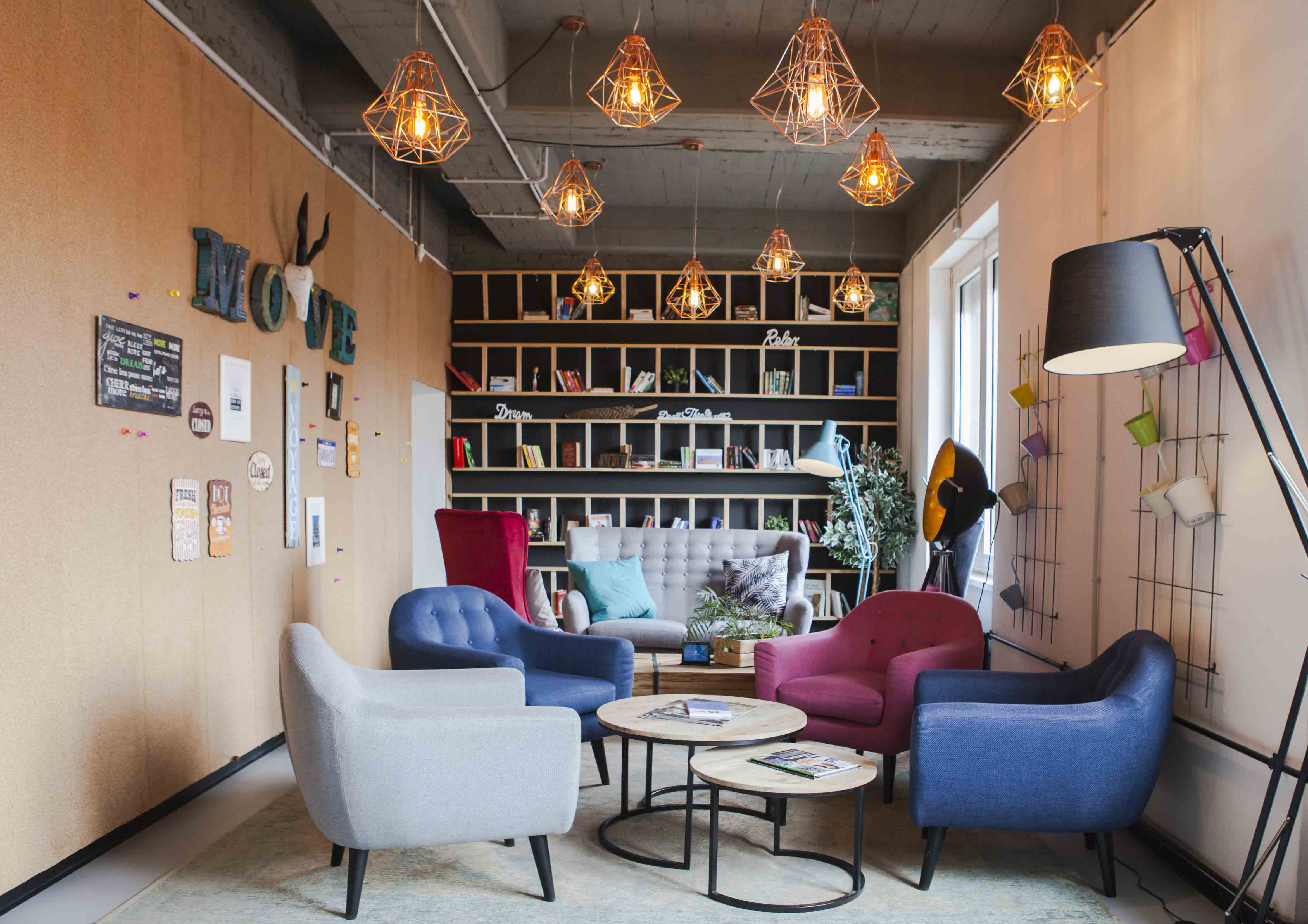
The design of the co-working is supposed to be an homage to it all. Accessible to everyone. Inklusive. The concept of a co-working space is certainly not a new one, but what we wanted to avoid is – categorization. We did not want to cater to the younger crowd and go trendy, nor did we want to be inaccessible to them. The profile of its tenants is vast, but they are all a part of the same community, connected figuratively and literally. It is meant for large companies and individuals, freelancers- all the same. Before coming up with the design, the owner expressed wanting the future company to be a status symbol- something recognizable to the general population. Everyone is to feel important, solely by being able to work & act at the place.
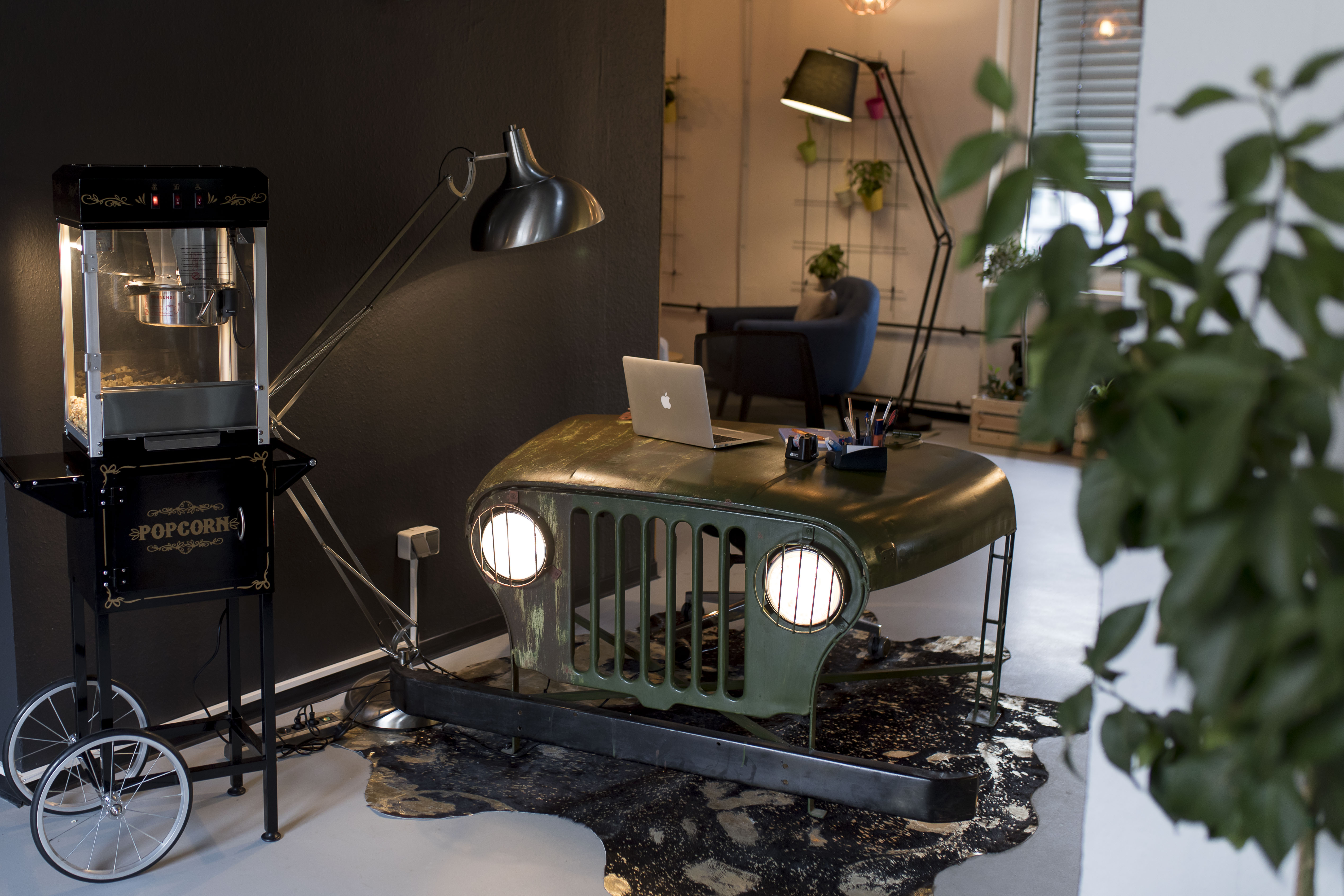
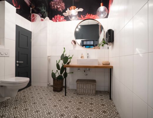
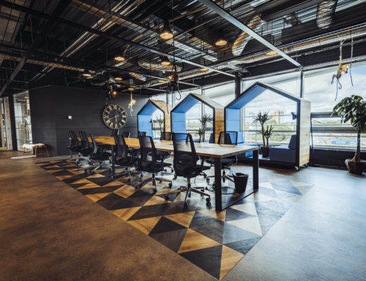
The interior design plays upon the notion of distinctiveness, is playful in itself- combining seemingly unmatchable elements. Black walls, triangle 2D & 3D floors, industrial style open co-working spaces and airy natural elements & materials for the closed offices, clipboards, rent24 logo wall, jeep reception desk, popcorn machines, telescope, telephone box, ping-pong table, the color contrasts, mirrors everywhere, wall art- all symbols and established CI elements for rent24 by now.
The first thing you will notice upon entering the space is an old jeep bodywork, which reflects upon the idea of the design concept perfectly. The antique and the modern, the industrial and organic.
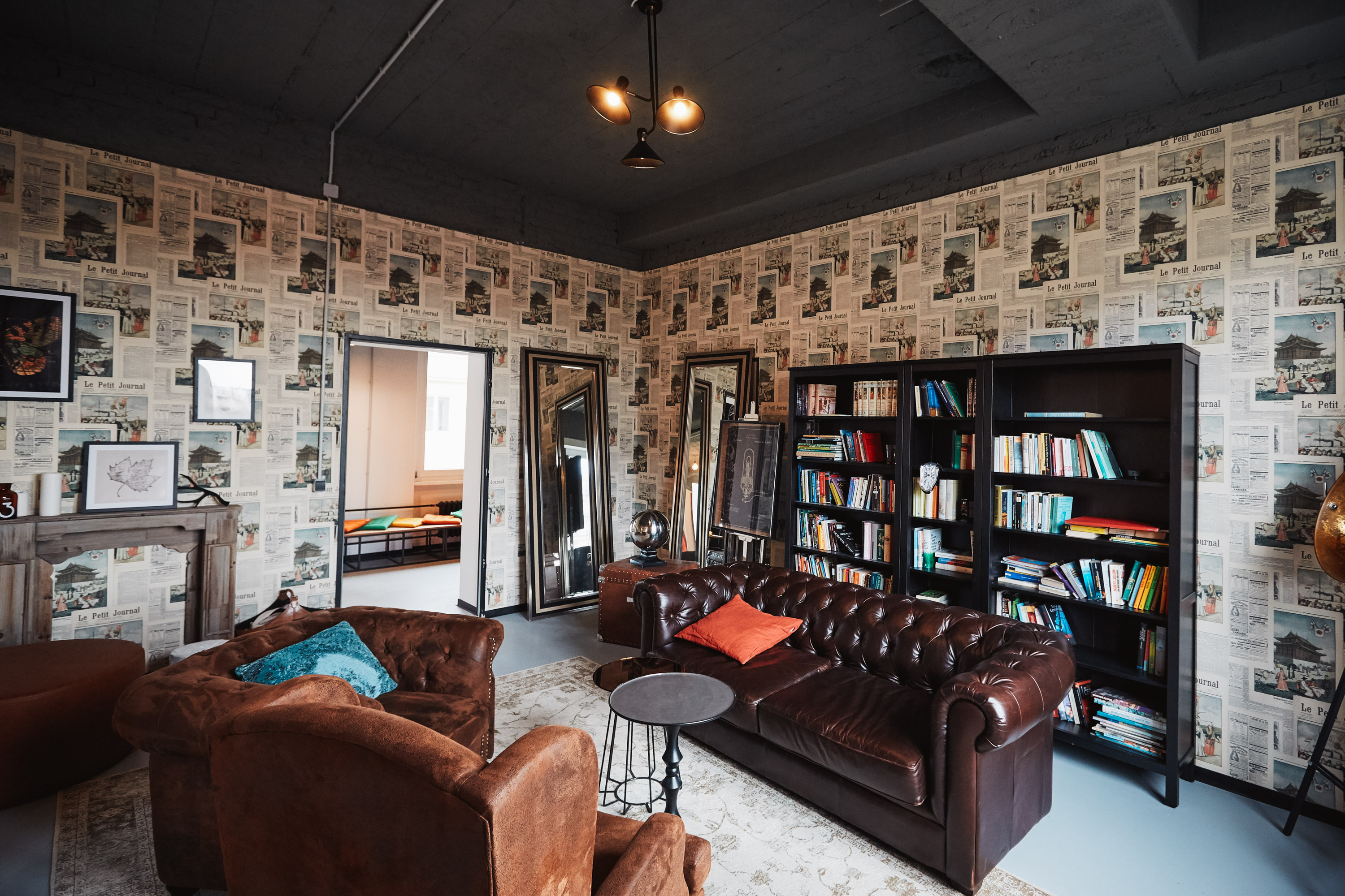
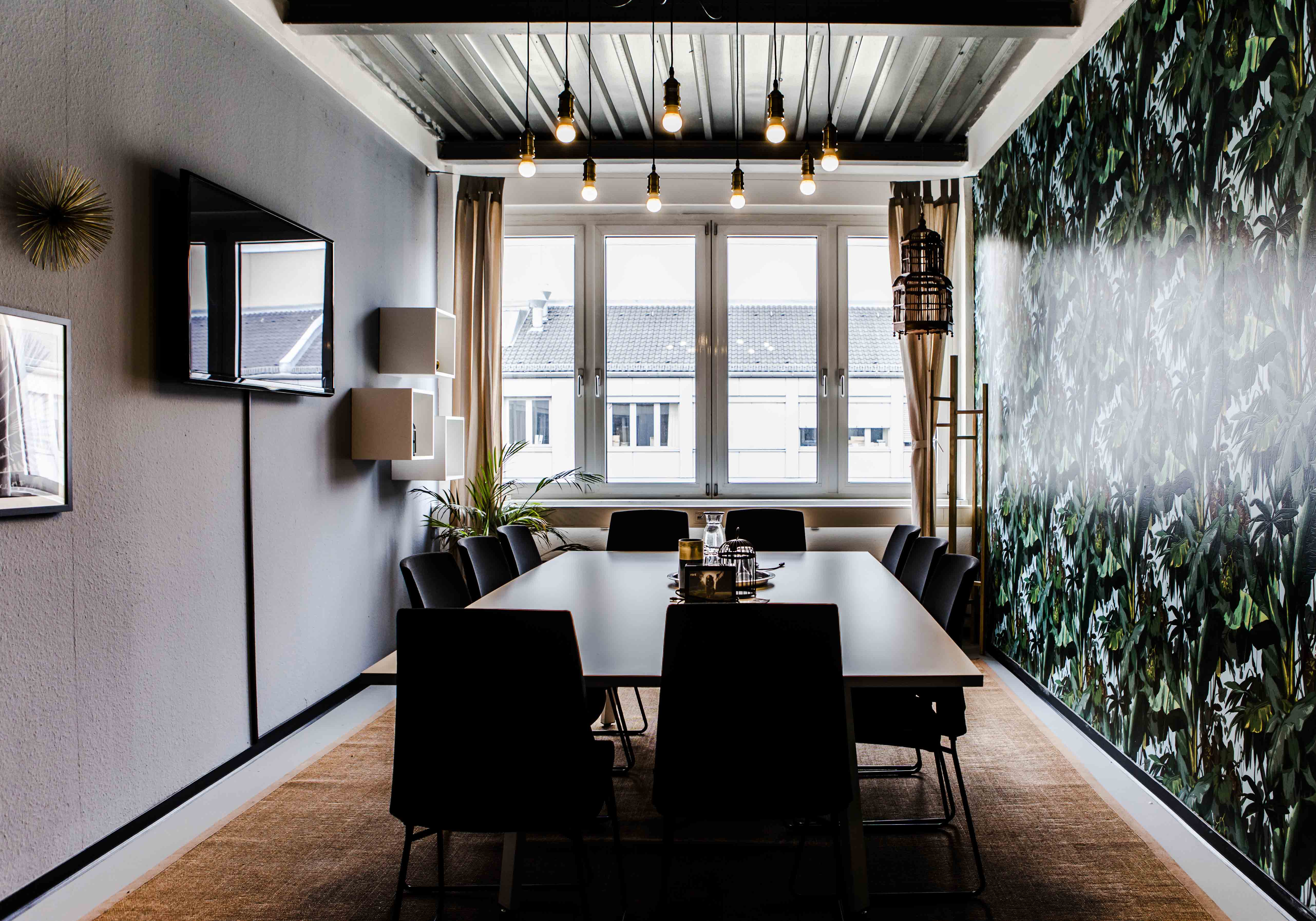
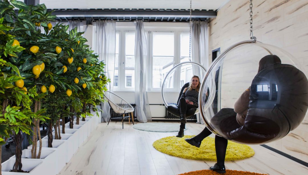
The large open working space, combined with the kitchen and the lounge area are all about encouraging open communication. Sharing both space and experiences. As is in every home, the central point is the kitchen, to provide for the homey feel. There are 4 different types of conference rooms, each with a unique theme and to suit the myriad of needs and wants of the user. Colors schemes are important and can subtly play upon the emotional state. the interior is always warm: I do not want to distance, I want to bring closer. The clientele is supposed to feel invited to use the space, feel comfortable. Besides the now very familiar Activity rooms which provide for some relaxation during the busy work schedule, the owner wished for a classical relaxation room, inspired by the English `cigar room`. Youthful fun combined with traditional classicism. There is also a Brainstorm room, where the users can bounce and exchange ideas. Motivating users and rising efficiency and productivity was also something meant to be induced by the design.
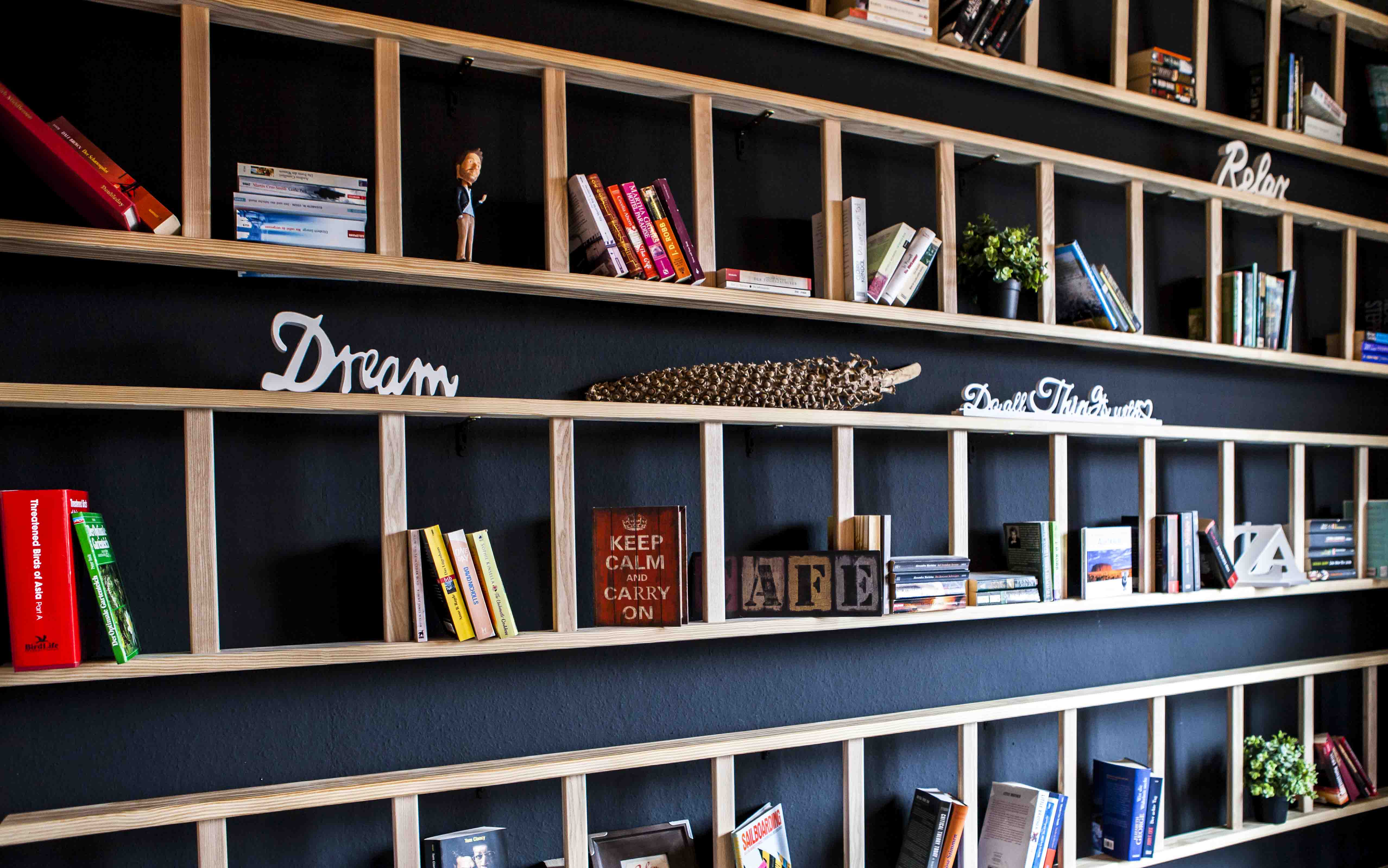
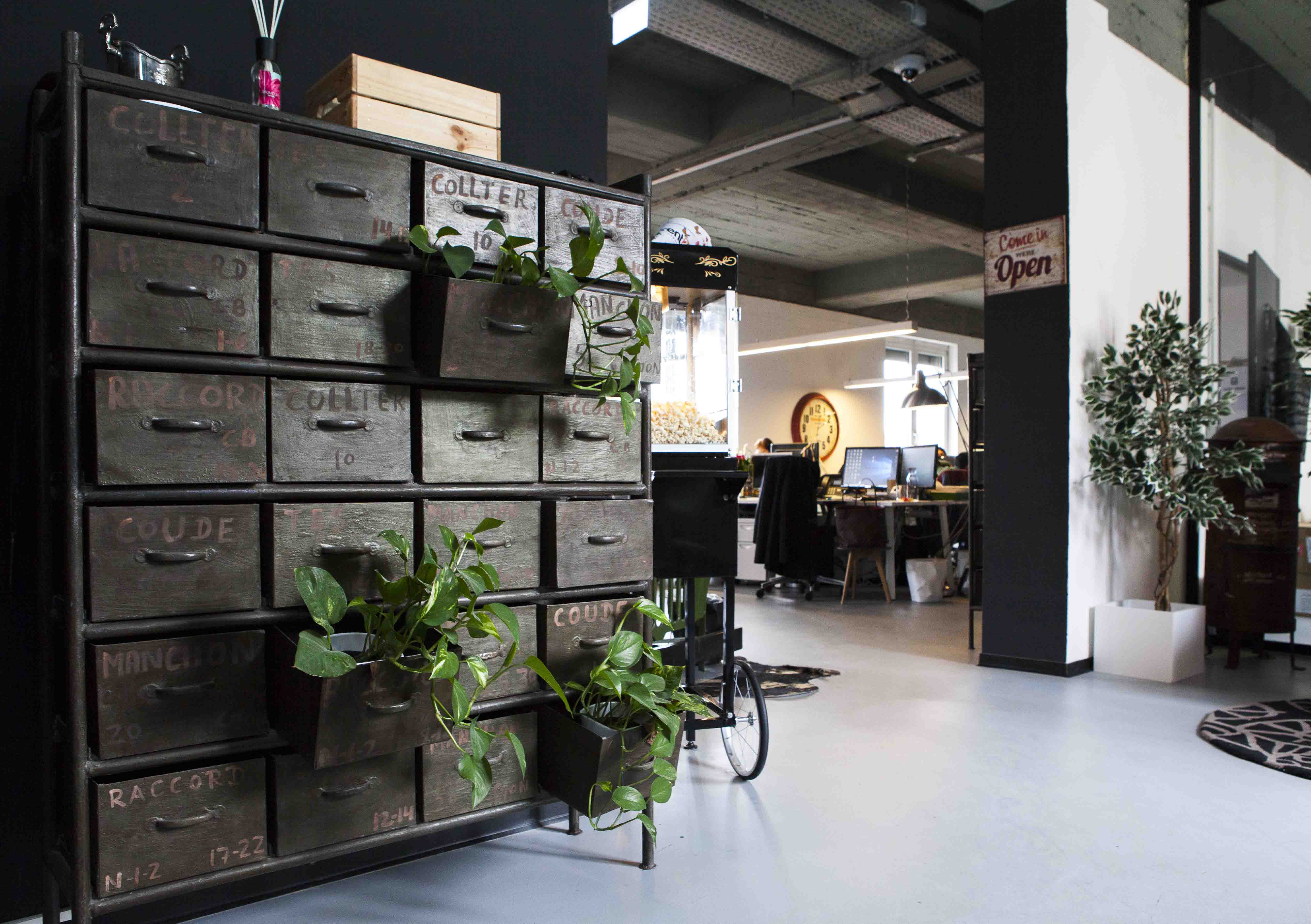
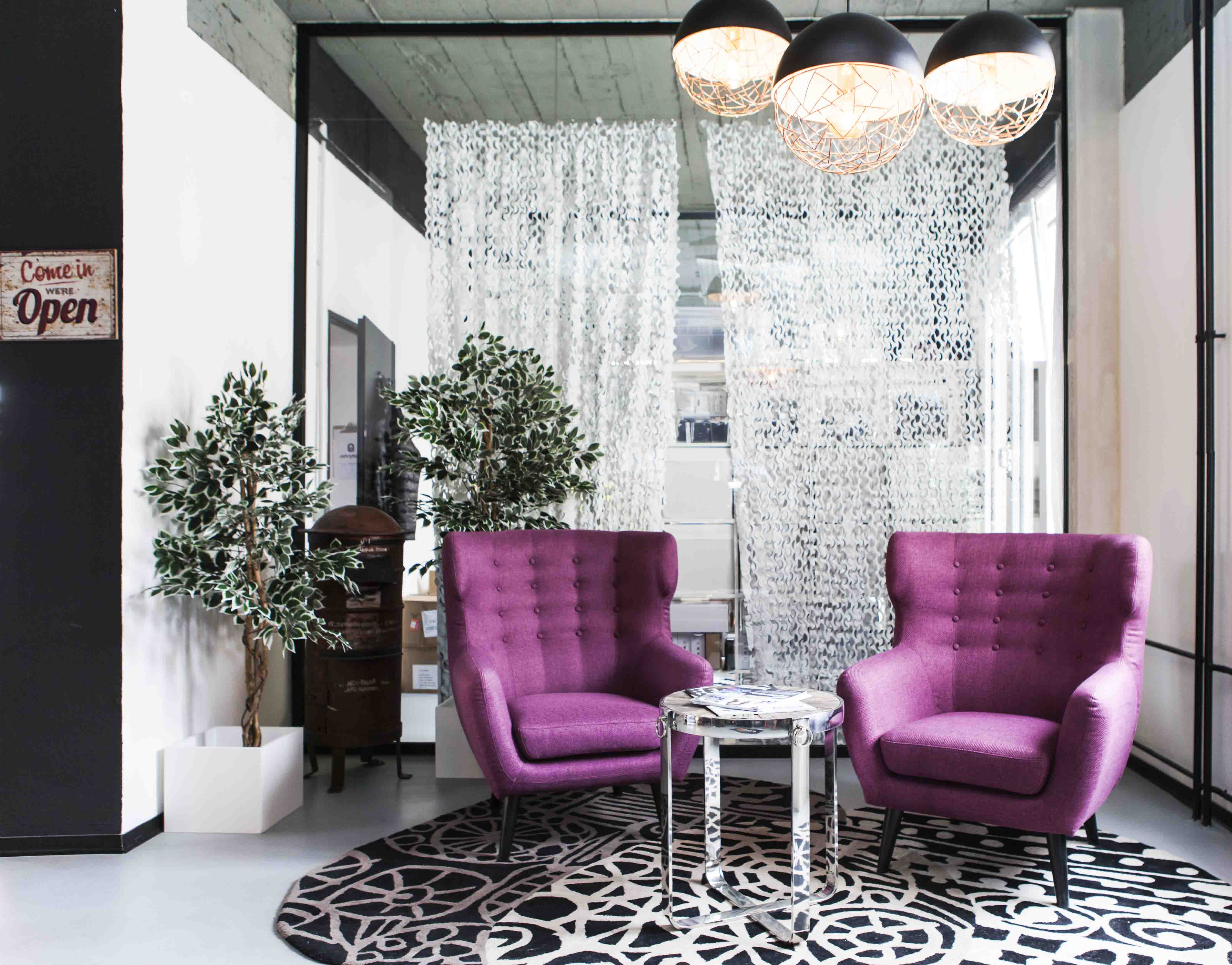 Pictures Rent24. Copyright Andreas Friese

No Comments